Excel Conditional Formatting: Make Data Speak
Scrolling through hundreds of rows to spot trends, outliers, or critical values is a waste of time. Excel’s Conditional Formatting turns your static tables into dynamic visual tools—it highlights what matters, hides what doesn’t, and eliminates manual checks. This guide uses the cleaned customer and sales data from our Data Cleaning Tutorial to show you practical, job-ready techniques.
Why Conditional Formatting Matters
For anyone working with CSV exports, database extracts, or daily reports, Conditional Formatting solves 3 big pain points:
- Speed: Identify top sales, late payments, or low stock in 2 seconds (not 20 minutes).
- Clarity: Turn confusing numbers into intuitive visuals (colors, icons, bars) for stakeholders.
- Accuracy: Avoid human error when flagging duplicates, missing values, or
outliers (building on your data cleaning work!). We’ll use this cleaned
sales dataset (from our prior tutorial) for all examples—save it to follow
along:
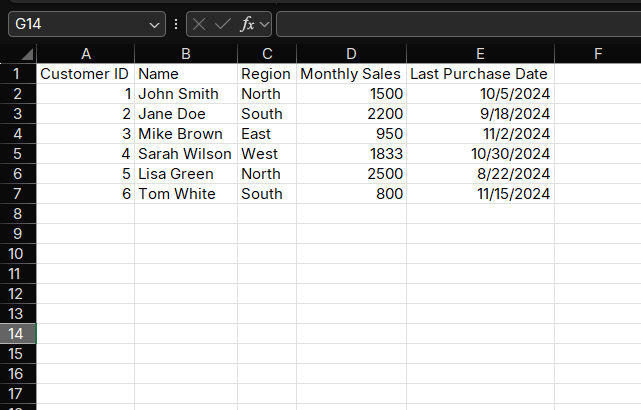
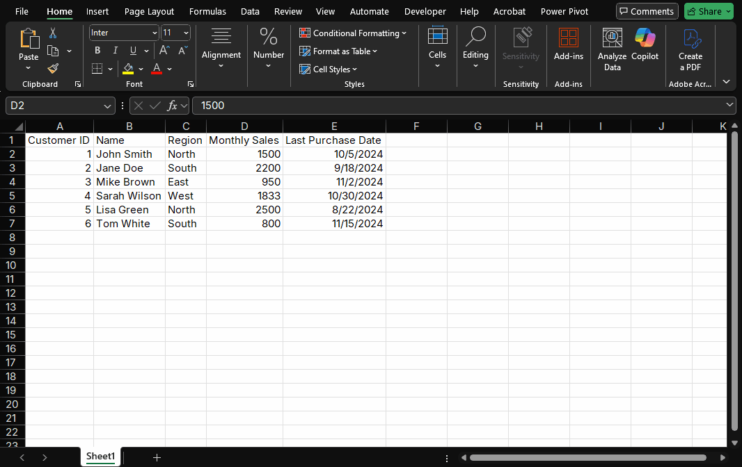
Cleaned Sales Dataset
Part 1: Getting Started (3 Simple Steps to Apply Any Rule)
Before diving into scenarios, master the core workflow—all Conditional Formatting tools follow this pattern:
- Select your data range: Click and drag to highlight the cells you want to format (e.g., D2:D7 for "Monthly Sales").
- Open the Conditional Formatting menu: Go to the Home tab → Click the Conditional Formatting dropdown (top-right of the "Styles" group).
- Choose a rule type: Pick from preset rules (e.g., "Highlight Cell Rules") or create a custom rule (we’ll cover both).
Part 2: 5 High-Impact Scenarios (With Step-by-Step Guides)
These are the most requested Conditional Formatting use cases for sales, marketing, and operations teams. Each builds on your cleaned data!
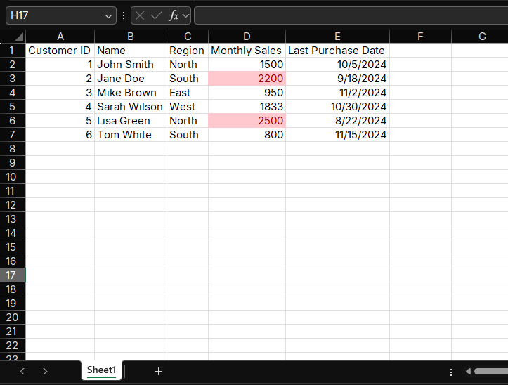
Scenario 1: Highlight Top/Bottom Values (Spot Key Performers)
Problem: You need to quickly find your highest and lowest monthly sales without sorting the entire table. Solution: Use "Top/Bottom Rules" to highlight outliers automatically.
How to Do It (Top 2 Sales):
- Select the "Monthly Sales" column (D2:D7).
- Conditional Formatting → Top/Bottom Rules → Top 10 Items.
- In the pop-up:
- Change "10" to "2" (we want the top 2 sales).
- Choose a format: "Light Red Fill with Dark Red Text" (or custom).
- Click OK.
Scenario 2: Color Scales (Visualize Trends in Numeric Data)
Problem: Numbers like 950, 1833, and 2500 are hard to compare—you want to see "relative" performance. Solution: Use "Color Scales" to turn values into a gradient (darker = higher value).
How to Do It:
- Select D2:D7 ("Monthly Sales").
- Conditional Formatting → Color Scales → Choose a preset (e.g., "Red -
Yellow - Green Color Scale").
- Red = Lowest value (800)
- Yellow = Middle value (1500)
- Green = Highest value (2500)
Why It Works:
Stakeholders can instantly see that Lisa (green) is the strongest, Tom (red) is the weakest, and others fall in between—no calculations needed.
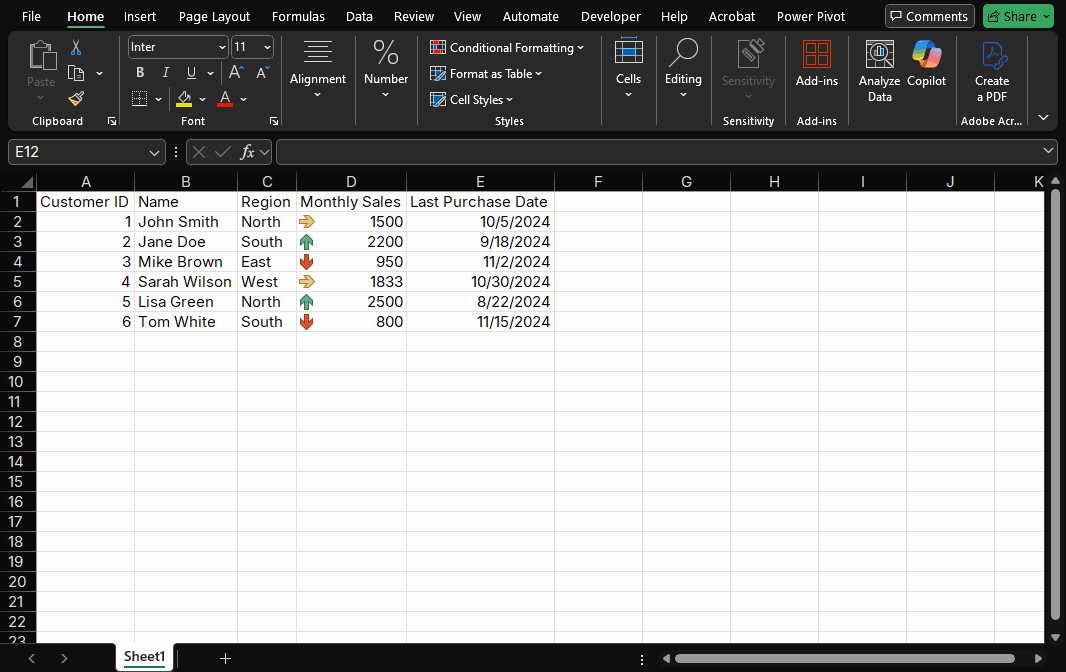
Scenario 3: Icon Sets (Flag Status with Symbols)
Problem: You need to categorize sales into "Good," "Average," and "Poor" for a quick report. Solution: Use "Icon Sets" (arrows, stars, flags) to label values by thresholds.
How to Do It (Custom Thresholds):
- Select D2:D7 ("Monthly Sales").
- Conditional Formatting → Icon Sets → 3 Arrows (Colored).
- To set custom thresholds (instead of defaults):
- Go back to Conditional Formatting → Manage Rules.
- Select the rule → Click Edit Rule.
- Under "Icon Criteria":
- Green Up Arrow: "Greater than or equal to" → 2000 (Good)
- Yellow Side Arrow: "Greater than or equal to" → 1200 (Average)
- Red Down Arrow: "Less than" → 1200 (Poor)
- Click OK twice.
Scenario 4: Highlight Duplicates (Catch Post-Cleaning Errors)
Problem: Even after data cleaning, duplicates (e.g., duplicate Customer IDs) can sneak in and skew analysis. Solution: Use "Highlight Cell Rules" to flag duplicates instantly.
How to Do It:
- Select A2:A7 ("Customer ID").
- Conditional Formatting → Highlight Cell Rules → Duplicate Values.
- In the pop-up: Choose a format (e.g., "Pink Fill with Dark Red Text").
- Click OK.
Bonus: Highlight Unique Values
If you want to find unique customers (e.g., first-time buyers), select "Unique Values" instead of "Duplicate Values" in Step 3.

Scenario 5: Formula-Based Rules (Dynamic Formatting for Complex Logic)
Problem: You need to highlight customers who haven’t purchased in 60+ days and have low sales (advanced logic). Solution: Create custom rules with formulas—this is Conditional Formatting’s most powerful feature.
Example: Highlight "At-Risk" Customers
We want to flag customers where:
Monthly Sales < 1000 AND Last Purchase Date was > 60 days ago.
How to Do It:
Select the entire data range (A2:F7).
Conditional Formatting → New Rule → Select "Use a formula to determine which cells to format".
Enter this formula (adjust dates/values to your needs):
=AND(D2<1000, TODAY()-E2>60)TODAY(): Gets today’s date.TODAY()-E2: Calculates days since last purchase.AND(): Ensures both conditions are true.
Click Format → Choose a style (e.g., "Orange Fill").
Click OK twice.
Part 3: Pro Tips to Avoid Common Mistakes
- Format the Right Range: Always select data cells (not entire columns) to keep your workbook fast (large ranges slow Excel down).
- Manage Rules Wisely: If formats aren’t working, go to Conditional Formatting → Manage Rules. You can edit, reorder, or delete rules here.
- Copy Formats with Format Painter: Use the "Format Painter" (Home tab) to copy Conditional Formatting to other tables (saves time!).
- Test with Dummy Data: Before applying to real data, test rules with a small dataset (e.g., add a fake "3000" sale to see if the color scale updates).
Part 4: Next Steps (From Formatting to Action)
Now that your data is visual, turn insights into action:
- Filter Highlighted Cells: Use Excel’s "Filter" tool to show only red-arrow sales (focus on low performers).
- Add to Dashboards: Copy formatted tables into your sales dashboard (pair with our upcoming Pivot Tables tutorial!).
- Share with Teams: Save the file as a PDF—Conditional Formatting stays intact for presentations.
Final Checklist
- ✅ Highlighted top/bottom sales with color
- ✅ Added a color scale for trend visualization
- ✅ Used icons to categorize performance
- ✅ Flagged duplicates (post-cleaning check!)
- ✅ Created a formula-based rule for at-risk customers
- ✅ Tested rules to avoid errors
Have a problem with Excel or Google Sheets?
Tell us about the issue you're facing, and we'll create a step-by-step guide for it.